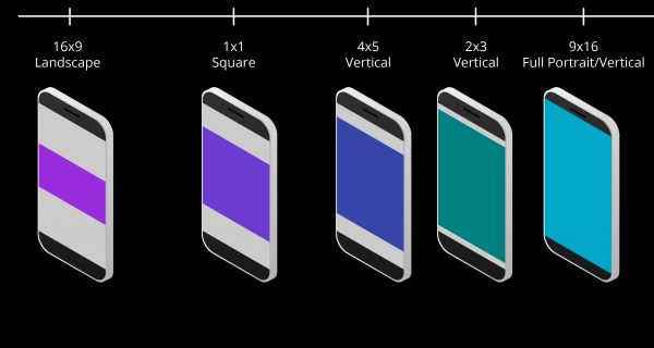
We’ve compiled a guide about composition and multi-aspect ratio in the world of social media video. Up until recently, a landscape (horizontal) 16:9 aspect ratio was the accepted way to shoot video. From silent film to streaming platforms, video has been created to favour the way our eyes take in the world. We are a wide angle-favouring species.
70% of millennials not rotating their phones horizontally to watch video.
However, with the prevalence of mobile devices, which favour vertical content designed to fit in our hands. More of us consume content through our mobile devices, with 70% of millennials not rotating their phones horizontally to watch video. Social media platforms are rushing to optimise their content to make the best of the screen size available to them. Enter the square (1:1 aspect ratio popularised by Instagram) and vertical (9:16 aspect ratio as popularised by Snapchat) video.
We recommend our full guide for Instagram, LinkedIn and YouTube video and content creators, or those generally interested in the use of video size on your social media content. Cerebriam Studio’s m:atio technology can help you navigate the world of multiple aspect-ratio friendly content through our video editing software.
For the more ‘tl:dr’ amongst us, here are the five highlights you need to know about composition and vertical video:
Always Evolving
Social Media and therefore aspect ratios are always evolving. Instagram and their 1:1 aspect ratio changed the video size we were comfortable consuming. While the 1:1 aspect ratio filled about 2/3 of a mobile screen. Snapchat did one better and introduced vertical video with a 9:16 video size, therefore filling the entire mobile screen. Editing software can help you navigate the different sizes, with Cerebriam Studio you’ll be able to use software that is also always evolving.
The Power of Composition
The composition of a shot, also known as the mise en scène, is the way a scene is composed. This includes the size of the frame used and how the set is arranged within the frame. A good composition should help emphasis the focus of the video and lead the viewer’s gaze to other areas of the screen if that is desired. The composition is your way of controlling what your audience looks at.
Your Set
Your set is a crucial way to maximise your impact within your composition. Depending on what video you are creating you need the right setting to highlight the necessary information. Some good guidelines of the type of video are to have a tidy, professional-looking working space with few distractions. If there are decorations or items in the foreground, they should be directly related to your product/brand or neutral and professional.
Know your Shots
The type of shot you use will directly impact the edits that are possible in post-production. While Cerebriam Studio’s m:atio technology can help you by zooming in on the focal point of your story, you can do some of the work in advance by knowing which shorts work best for which aspect ratio. For instance, a wide-angle shot or long shot is great for a horizontal or 16:9 aspect ratio. The square (1:1) or vertical (4:5, 9:16) aspect ratio is better suited to a close-up or mid-shot.
Vertical Video & Vertical Lines
Vertical lines in vertical video can be both your friend and your foe. The use of vertical lines in a vertical video can add strength to an image and also make things look taller than they are. However, you must be careful, for example, if you pan across tall, slim buildings quickly you may leave your audience feeling nauseous. To solve this, pan slowly or use jump cuts. When designing your video place yourself in the shoes of your audience and consider how your video will come together when editing.

